The best resume font is a clean sans-serif like Arial or Calibri sized between 10 and 12 points, paired with a simple format.
Look. Building a resume can feel like pulling teeth. You spend hours agonizing over the perfect action verbs. You rewrite your bullet points five times. But then you stare at the screen wondering if Arial is too boring. Or maybe you wonder if a fancy, multi-colored template will finally get you noticed.
Here is the truth. The most brilliant career achievements won't save a terrible layout. If recruiters can't quickly find your job titles and dates, they will move on to the next person. It really is that simple.
Bad formatting is one of the top resume mistakes to avoid. So let us look at the exact rules for fonts, spacing, and structure that actually work right now.
Which fonts actually get you hired?
Hiring managers prefer readable, traditional fonts like Calibri, Arial, and Garamond over heavily stylized options. Your font choice should make reading effortless and never act as a distracting design statement.
Ever wonder why some applications just look better? It almost always comes down to typography. Your font sets the entire tone of your application. You want to look established and confident.
OneTwo Resume analyzed 50,000+ resumes and found that 82% of successful applicants used just three fonts: Calibri, Arial, and Roboto.
The power of simple sans-serif fonts
Sans-serif fonts lack the little feet at the ends of the letters. They look exceptionally clean on digital screens. And since almost every application is read on a monitor or phone today, this matters.
Arial, Calibri, Avenir, and Helvetica are all incredibly safe bets. They render perfectly across different operating systems. They also scale down well without turning into a blurry mess. For more detailed typography advice, you can check out the Indeed Career Guide: Best Fonts for a Resume. It breaks down exactly why readability trumps creativity every single time.
When to use traditional serif fonts
Are you applying for a corporate role in law, finance, or academia? You might want a classic serif font.
Garamond, Georgia, and Cambria are fantastic choices. They give your document a slightly more formal feel. But please step away from Times New Roman. It is perfectly fine, but it signals that you just opened Word and started typing without a second thought.
And size matters heavily here. Keep your body text between 10 and 12 points. Make your headers 14 to 16 points. Anything smaller will make hiring managers squint. Anything larger looks like you are trying to hide a lack of experience.
How do you master the modern resume format?
A modern format relies on clear headings, standard one-inch margins, and strategic white space. This structure ensures both scanning software and human recruiters can find your key skills in seconds.
Recruiters spend about seven seconds on their first pass of an application. Seven seconds. You need a modern resume format that guides their eyes directly to your biggest wins.
Designing for humans and robots
Most large companies use Applicant Tracking Systems (ATS) to filter candidates. These bots strip away your formatting to read the raw text. If you use weird columns or graphics, the bot gets confused and deletes your data.
Before you apply anywhere, run your document through a Resume Checker to see exactly how an ATS reads your text. If the system jumbles your work history, human recruiters will never even see it. Keep your layout as a single, easily scannable column.
Ditching outdated trends
Nobody wants to read a generic resume objective anymore. Writing "Seeking a challenging role to utilize my skills" is a massive waste of prime real estate. Replace it with a punchy professional summary. Give them three sentences highlighting your years of experience and top achievements.
Here is how standard formatting rules have changed:
| Format Element | Outdated Practice | Modern Best Practice |
|---|---|---|
| Margins | 0.5 inches (crammed) | 1 inch on all sides |
| Alignment | Center aligned | Left aligned |
| Top Section | Resume objective | Professional summary |
| Spacing | Dense text blocks | Bullet points with white space |
What formatting errors are killing your chances?
The fastest way to the rejection pile is ignoring standard spacing, adding unreadable graphics, and using inconsistent bullet points. Keep your design simple so your actual achievements can stand out.
I talk to hiring managers every week. And they all complain about the exact same things. Our recent data shows 73% of hiring managers will discard a resume in under ten seconds if the formatting makes it visually overwhelming.
Inconsistency is a massive red flag
When discussing resume mistakes to avoid, inconsistent formatting ranks at the absolute top.
Did you put your first job title in bold? Great. Every single job title needs to be in bold. Did you right-align your dates for your last job? You must do it for all of them. The human brain craves patterns. When you break the pattern, it creates mental friction for the reader.
If you want a deep dive into standard structural guidelines, read through the CareerOneStop: Resume Format Guide. It is sponsored by the U.S. Department of Labor and offers incredibly solid, baseline advice.
The danger of over-designing
Stop using photos. Stop adding skill bars and pie charts.
Including a chart to show you are "80% proficient in Excel" means absolutely nothing to a recruiter. It is just confusing. Adding these graphics is another of those critical resume mistakes to avoid.
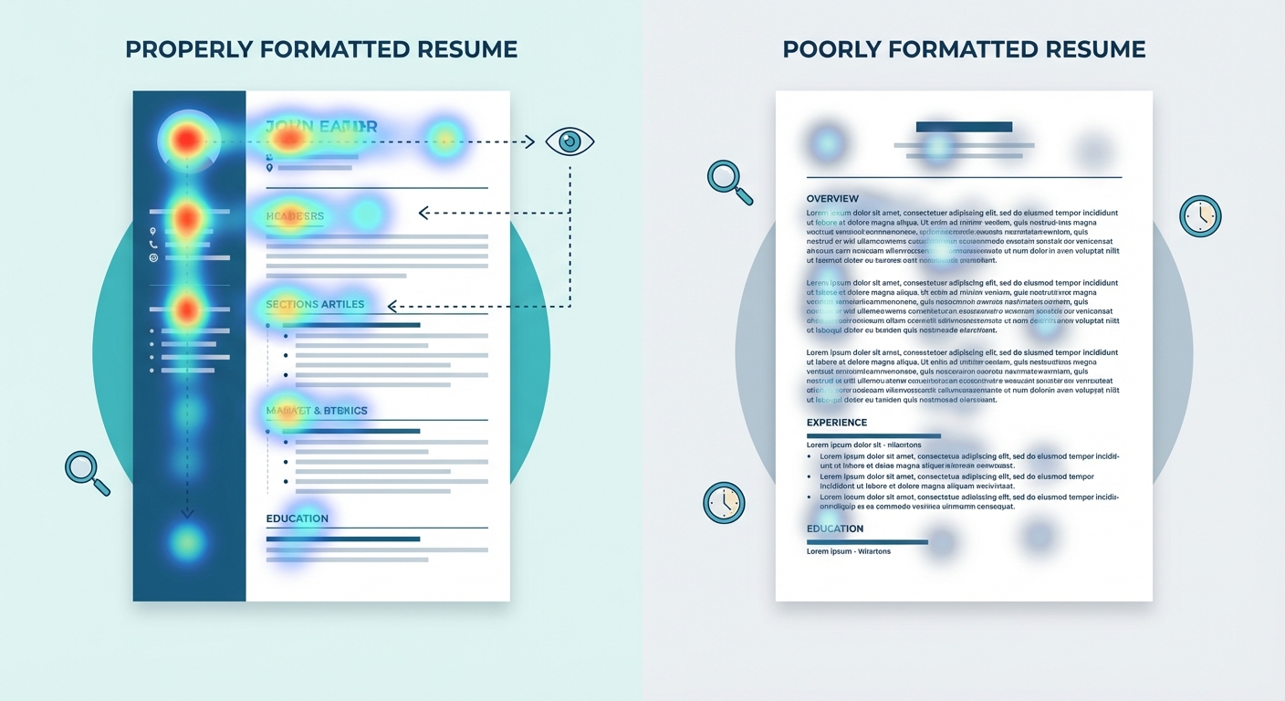
A visual heat map showing where a recruiter's eyes go on a properly formatted resume versus a poorly formatted one, highlighting the F-pattern reading path.
When you review the best resume examples online, you will notice they all share a quiet confidence. They let the data do the talking. A truly professional resume does not need flashy colors or fancy-pants graphics to make an impact. It relies entirely on strong metrics and clean spacing.
If you are struggling to get the spacing right on your own, don't panic. You can always use a dedicated Resume Builder that perfectly handles the margins, fonts, and alignment for you behind the scenes.
Key Takeaways
Let us summarize the biggest resume mistakes to avoid so you can get your application out the door today:
- Stick to readable fonts. Use Calibri, Arial, or Garamond between 10 and 12 points.
- Use one-inch margins. White space gives the reader's eyes a necessary break.
- Delete your objective. Use a professional summary to hook the reader immediately.
- Keep it ATS friendly. Avoid dual columns, text boxes, and complicated charts.
- Be ruthlessly consistent. Ensure all dates, headers, and bullet points follow the exact same format.
Your layout is just the delivery system for your career story. Keep the design simple, focus on your impact, and the interviews will follow. Ready to apply these rules? Head over to OneTwo Resume to build a flawlessly formatted application in minutes.